How to Create Presentation Slides with Text on Images that Pop (Part 1)
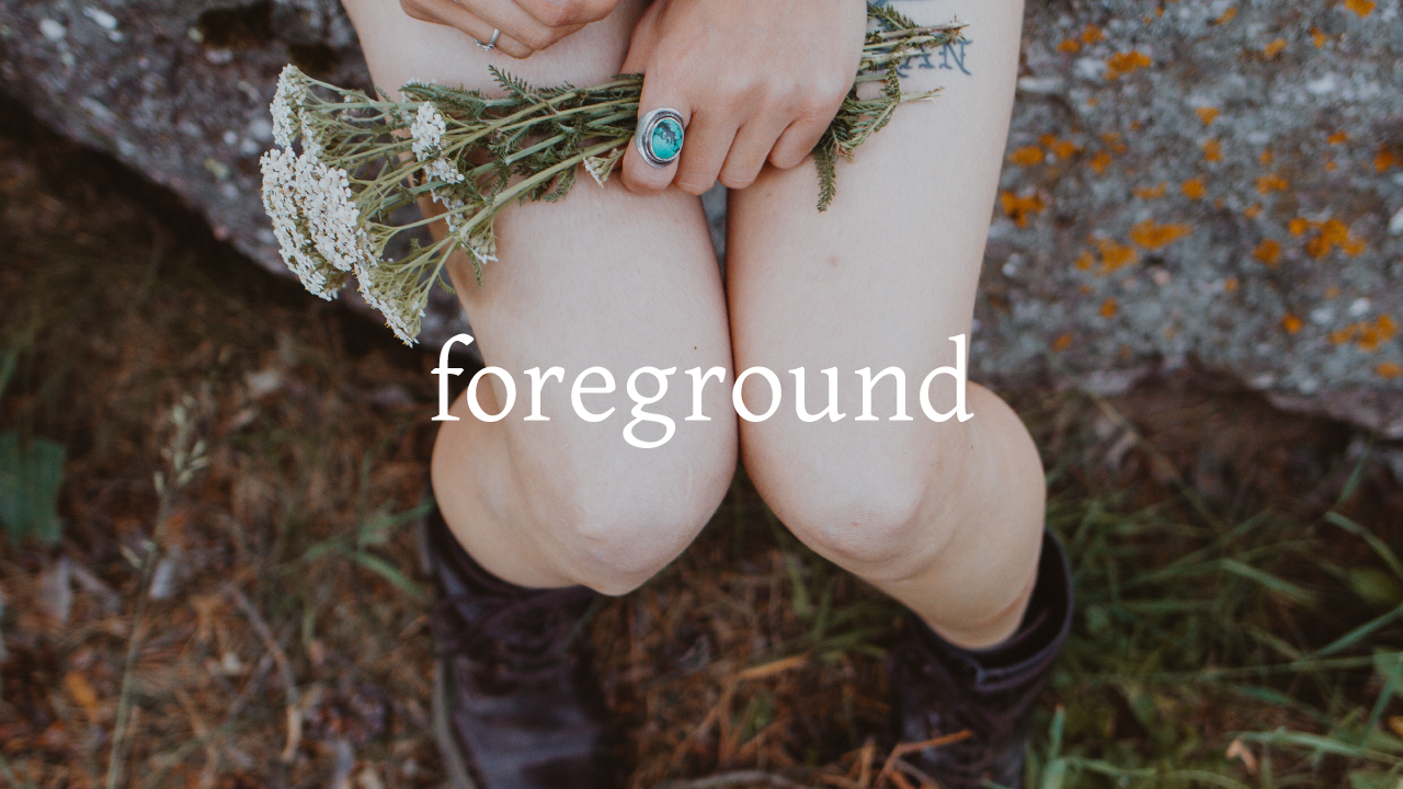
This finished photo-type composition is successful because the imagery is evocative and the text is easy read, two ingredients for effective presentation slide design.
Vision has long been our most powerful sense. Sight was essential to our survival as hunters and gathers during the Stone Age. Although the written word was invented thousands of years ago, we still process visuals faster than text. Pictures have the power to spark the imagination and draw emotion from the heart. Presentation slides that harmoniously combine text and image can convey your message effectively by compelling viewers to form a deep connection with your ideas.
Successfully combining text and image is hard — it’s an art, not a science. When done well, text and photo compositions can become iconic and lasting; done poorly, they are hard to read. Poorly designed reading experiences reflect poorly upon your ideas, making your message easy to dismiss. Fortunately, the fields of fine art and graphic design have developed tried-and-true techniques for combining words and pictures that we can apply to presentation design, based on the concept of contrast.
Contrast relates to how we see the world. It’s a measure of how visually distinct an object is from its background. The greater the contrast between a foreground object and its background image, the more visually distinct the foreground object becomes.
Let’s use Google Slides to illustrate how contrast can help create compelling layouts, suited for a presentation slide, like the one below.
1. Identify a background image with enough contrast to make your text pop
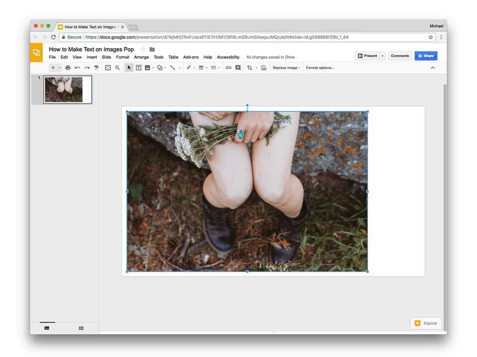
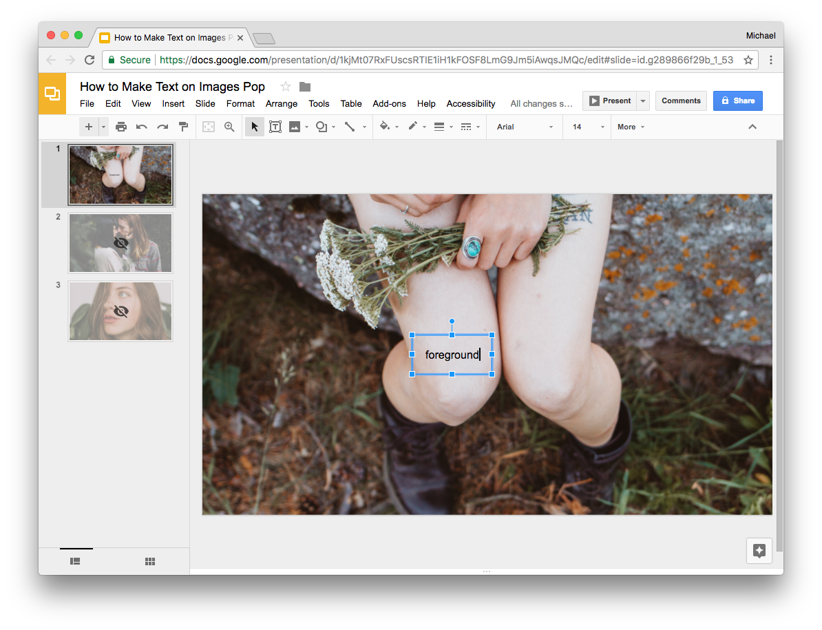
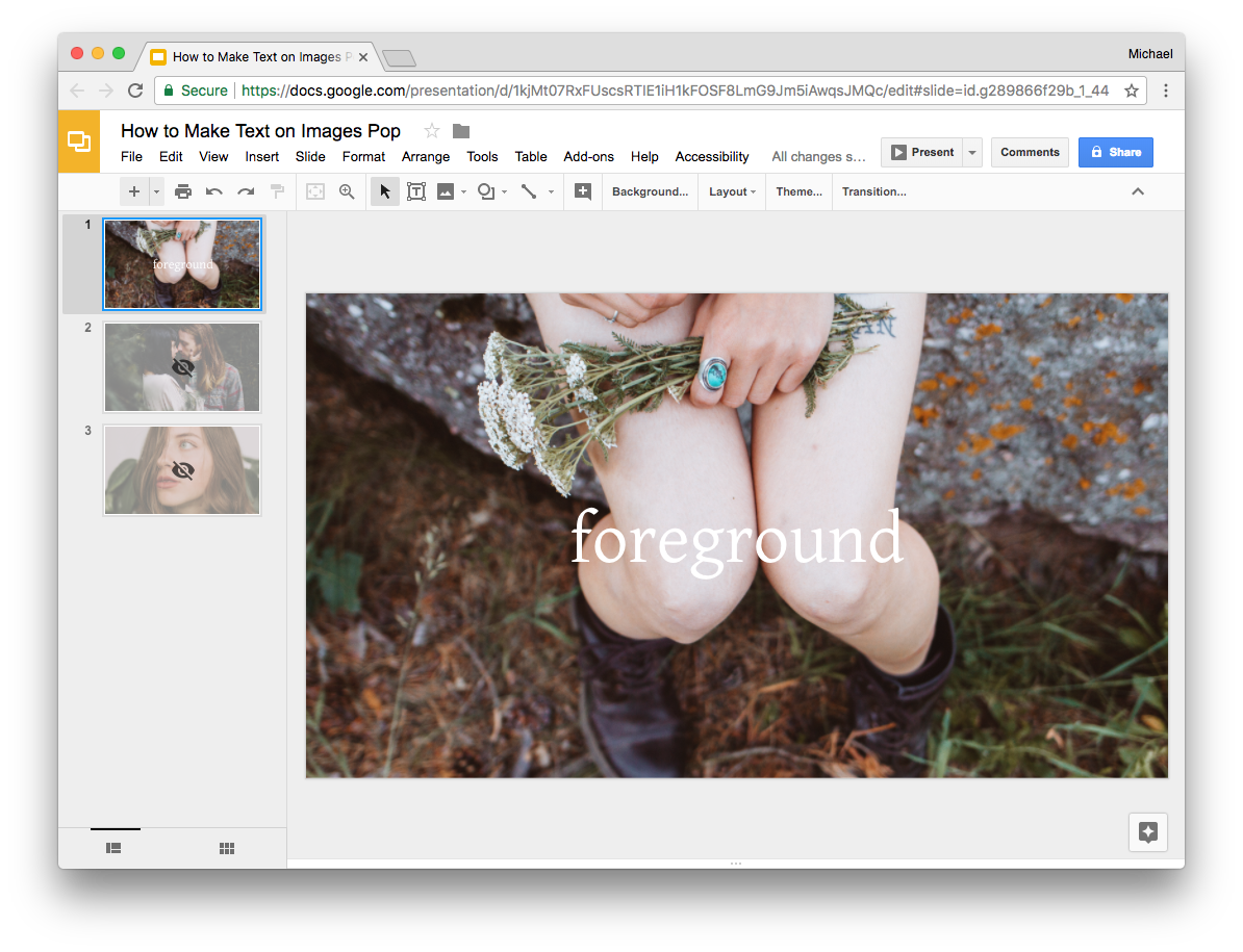
I’ve chosen the photo you see in the slide above for its mix of content and form. It evokes a time — youth — and place — nature. It’s sensory. Close your eyes and it’s easy to imagine a warm summer breeze and the smell of wildflowers. Formally, the center of the image is an even color and smooth texture, creating ample contrast for text placed in the foreground.
Another way of thinking about contrasting areas within a photo is what graphic designers call negative space. In fine art and design, negative space is the area surrounding the subject of a composition.
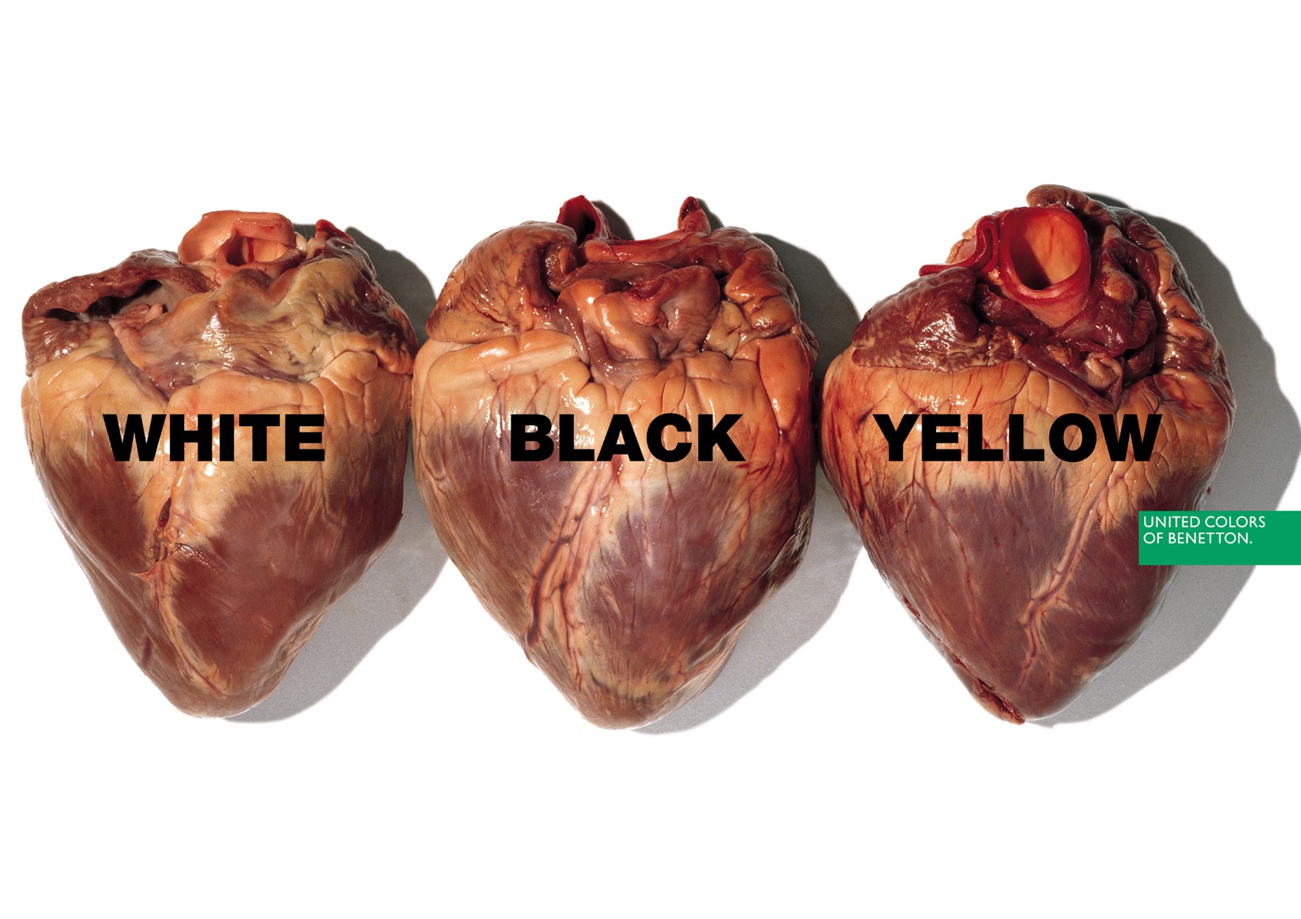
All great graphic designers are able to find negative space within a photo, no matter how small it appears. See the example below by the designers of Girlfriend Collective.

Negative space can be hard to spot, but you can train your eye to recognize it with practice and experimentation. The photo above contains another area of negative space, can you see it? It’s directly above the sternums of the figures in the middle.

Let's apply this way of seeing to our example:
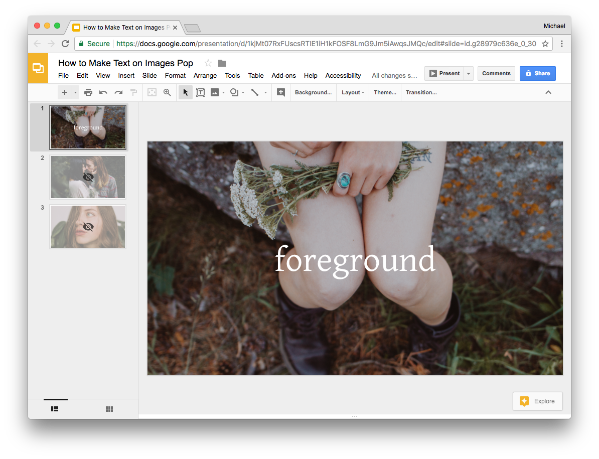
2. Open Google Slides and create a blank slide.
3. Insert an image by selecting Insert → Image from the File menu.
4. Scale the image by holding down Shift and dragging a corner point until it covers the entire area of the slide.
5. Remove the area that extends beyond the slide’s bounds by pressing the Crop Image button located in the toolbar.
6. Add text by selecting Insert → Text Box from the File menu.
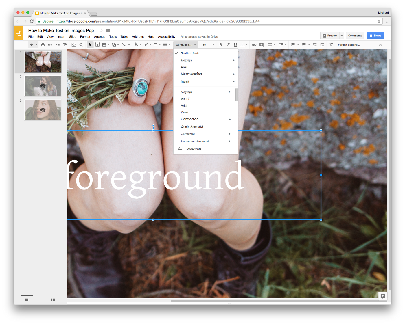
7. Create contrast by increasing the text’s font size and changing its color to white.
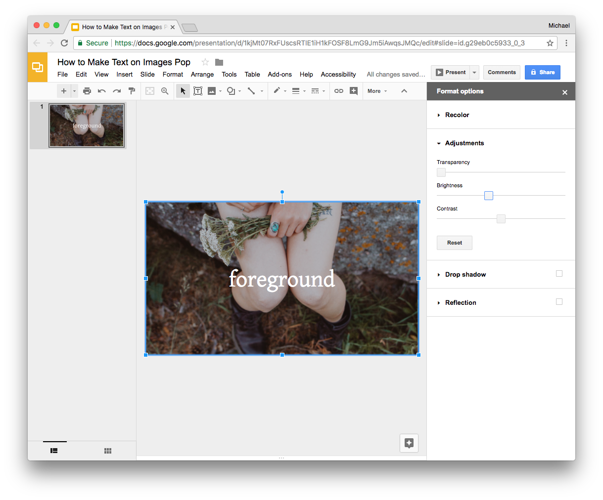
8. Increase contrast by darkening the background image. Select the background image then click Format options… from the toolbar. Click Adjustments to view the Brightness settings, then darken the image by ~-20%.
Voilà! You’ve created a photo-type composition with the eye of an art director. Stay tuned for parts 2 and 3 of this series where I’ll cover additional ways of making your text pop, inspired by the fine artist Barbara Kruger and contemporary web and app design.
If you liked this post and use Google Slides, you’ll probably like Journal, a visually stunning Google Slides template I created. It’s informed by 10+ years of experience crafting slide decks while working at places like IDEO and Etsy. presentation.design readers can enjoy 50% off via this link and checking out with Paypal.


