How to Create Presentation Slides with Text on Images that Pop (Part 2)
Combining text and image is useful when designing presentations. Presentation slides that simultaneously convey ideas with words and spark imaginations with pictures, compel viewers to form a deep emotional connection with your message. As a presenter, the more connections you’re able to make with your audience, the more memorable your content becomes.
Creating simple and beautiful word and picture compositions is hard. They require contrast. Contrast is a measure of how visually distinct foreground text is from its background image. If there is too little contrast between text and image, viewers are unable to distinguish each, creating a barrier to understanding meaning and intent.
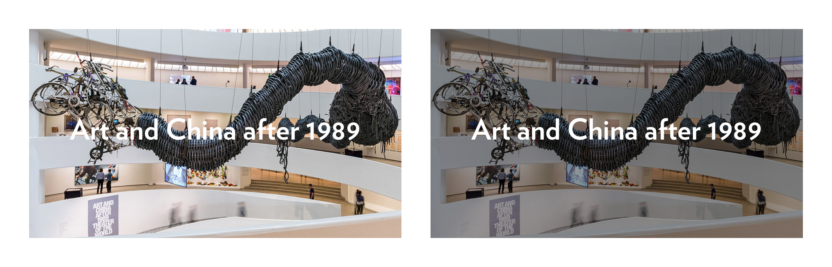
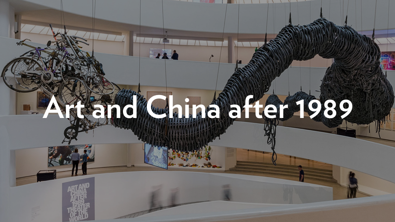
The example above relies on lowering the brightness of the background image to increase visual contrast. What if you want to create a photo-text composition that doesn’t dim the background image? Fortunately, the fields of fine art and graphic design have developed tried-and-true techniques to create contrast. One of them is commonly referred to by graphic designers as “knocking out text.”

Knocked out text is text set in white and placed above a tightly bound contrasting field of color. It was pioneered by Barbara Kruger — an American conceptual artist — in the 1980s, then appropriated by the streetwear brand Supreme in the 1990s.

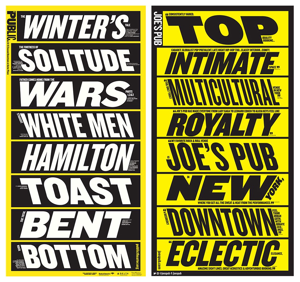
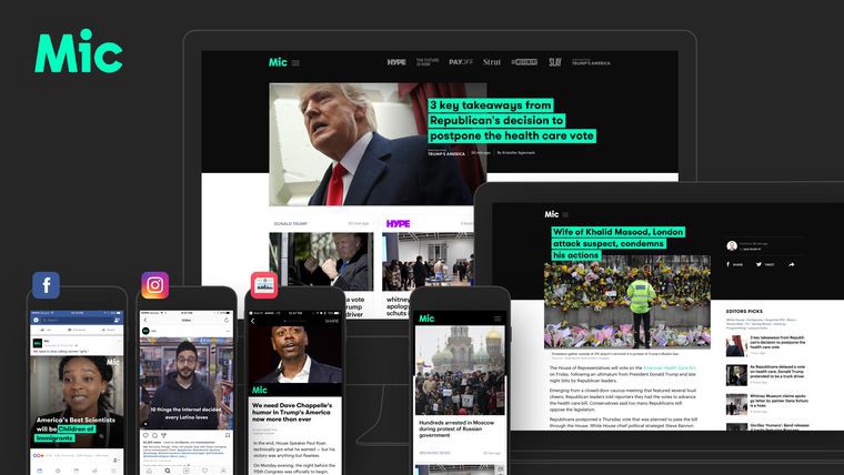
Since then, graphic designers have relied upon this technique in contemporary print and screen-based designs. Notable examples include Paula Scher’s brand and identity work for The Public Theater and designs for the online editorial website Mic.com.
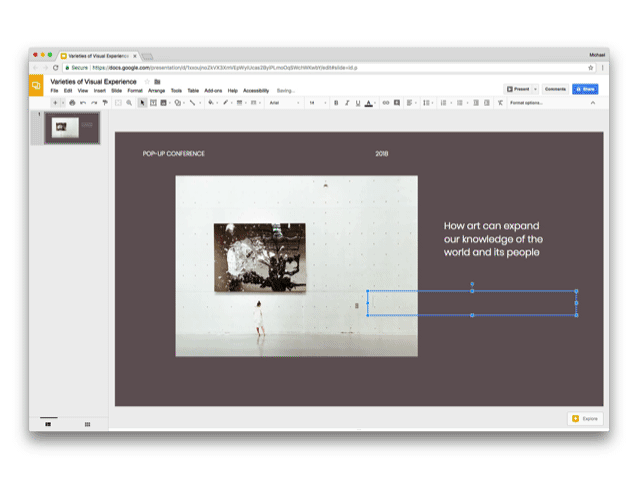
Let’s use Google Slides to create a compelling layout featuring knocked out text, suited for a presentation slide, like the one below.

Step 1:
Let’s add the title of this slide — “Varieties of Visual Experience” — and set in white at 36 points. I changed the font from Arial to Poppins to give it a contemporary vibe.
Step 2:
Knock out your text by highlighting it then pressing the Text Color button in the toolbar to reveal the corresponding dropdown. Press the Highlight tab then pick Black from the gray scale.

Ta-da! You’ve successfully knocked out text that dynamically updates while typing. Stay tuned for the third and final part of this series: making text pop inspired by contemporary web and app design.
If you liked this post and use Google Slides, you’ll probably like Journal, a visually stunning Google Slides template I created. It’s informed by 10+ years of experience crafting slide decks while working at places like IDEO and Etsy. presentation.design readers can enjoy 50% off via this link and checking out with Paypal.


